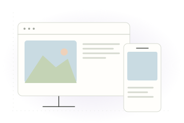
Block-based layout
Courses are built from content blocks instead of rigid pages, so designs naturally reflow on different screen sizes
ScormStack automatically turns your courses into responsive experiences that look great on laptops, tablets, and phones. Every slide, image, video, and interaction adapts to the learner's screen so you don't have to think about layouts or device types.
What you design in ScormStack is what learners see in their LMS—without extra work to handle breakpoints or mobile versions.

Courses are built from content blocks instead of rigid pages, so designs naturally reflow on different screen sizes
Images, videos, and carousels resize gracefully, preserving readability and impact on small and large displays alike
Themes keep typography, colors, and spacing balanced, giving learners a polished experience regardless of device
Join thousands of e-learning professionals and teams who've made the switch to ScormStack to turn ideas into high-performing courses, fast.
Start for free30 days free, no credit card required